


Allow me to paint a scene: you get a new dataset and need to explore it, so you don’t change a single number, but you make three different visualizations. If you showed those visualizations to three different people, they’d likely walk away with three slightly different impressions of what the data means. That is one of the things I find most fascinating about data visualization.
We often talk about visualization as if it were simply the final step in a data-analysis pipeline: collect the data, clean it, analyze it, and then make a nice chart. But that is not accurate at all! Visualization isn’t just a picture of the data; it is an interpretation layer between the data and the person looking at it.
That means when we choose a chart, an axis, a scale, a grouping, or even what to leave out, we are making decisions about the story the reader will see… even though the data hasn’t changed, the story it’s telling has.
Anyone who works with data knows that the difficult part is rarely just getting a graph onto the screen. The difficult part is deciding which graph we show. Should we focus on the trend? The difference between groups? The variability? The outliers? The rate of change? The distribution? Or perhaps something that isn’t immediately obvious in the raw data?
Two visualizations can be completely accurate and still lead the viewer toward very different conclusions, which doesn’t automatically make one of them misleading. But it shows how visualization is fundamentally about representation.
One important question here is: Which chart should I use? But a better question is: What aspect of the data am I asking the reader to notice?
This article is my way of answering that question.
One dataset, more than one story
I love to work out, and I’ve been working out for over 6 years. And because I am both a workout lover and a data enthusiast, suppose I want to represent the relationship between how long someone has been training and their strength.
The first thing I could do is plot strength against years of training using a simple line graph.
It looks reasonable. Looking at the graph, you can see that as training time increases, strength increases. That is not wrong, but there is a problem! The line makes the relationship look continuous and almost linear.
But if you have done any amount of working out, you know real progress rarely feels like that. Strength doesn’t necessarily increase by the same amount every month or year.
So let’s change our focus! Instead of connecting the observations with a smooth-looking line, we could use a step-like representation.
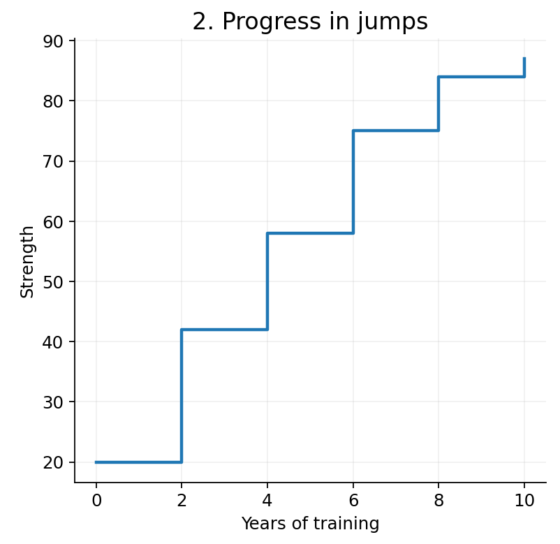
Now the same underlying information emphasizes something different: strength tends to increase in stages rather than continuously. As you can see, the numbers haven’t changed; our interpretation has, and so has the message we’re delivering.
We can take this even further. Suppose we use a logarithmic scale for strength while keeping time linear. Now the visualization can emphasize something many people experience when they start training: large improvements early on followed by progressively smaller gains.
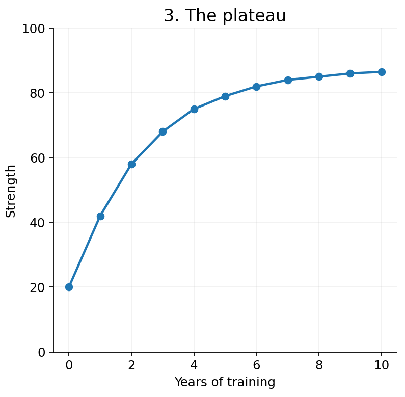
Fitness communities often call this “newbie gains.” Again, we haven’t changed the underlying data. We’ve changed the coordinate system through which we view the data.
A linear scale treats equal numerical differences as equally spaced. Whereas a logarithmic scale represents equal ratios as equally spaced. Neither is inherently more truthful.
Okay, what happens if we change which variable gets the logarithmic scale?
We might instead emphasize that progress continues over time, while how we perceive differences between strength levels changes. Suddenly, the visualization is not just showing a relationship. It is helping us think about the relationship in a particular way.
Guess what, we can go even further! A box plot could emphasize variability across training sessions. A bar chart could compare different training periods. A scatter plot could show the individual observations rather than connecting them into an apparent trajectory.
Every one of these choices tells the viewer to pay attention to something different. That is the point and importance of choosing which graph to use.
The elements of the story!
1. The chart
This is where data visualization becomes more interesting than simply choosing between a bar chart and a line chart. When we are choosing a visualization, we need to make a lot of decisions:
-
What goes on the x-axis?
-
What goes on the y-axis?
-
What scale do we use?
-
What gets grouped?
-
What gets separated?
-
What gets highlighted?
-
What gets hidden?
-
What context does the reader receive?
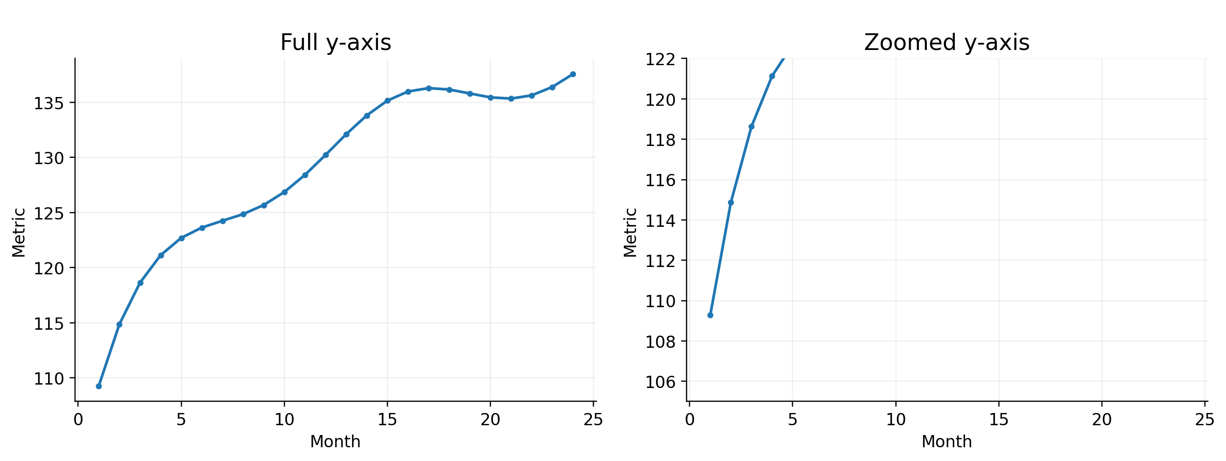
None of these questions changes the original observations, but they can change the conclusion a reader reaches. Every decision matters; consider something as simple as the y-axis. A bar chart whose axis starts at zero tells us something different from one that begins close to the observed values.
A small difference can appear dramatic when the axis is tightly cropped. Though the underlying values remain correct, the visual impression changes.
2. The aggregation
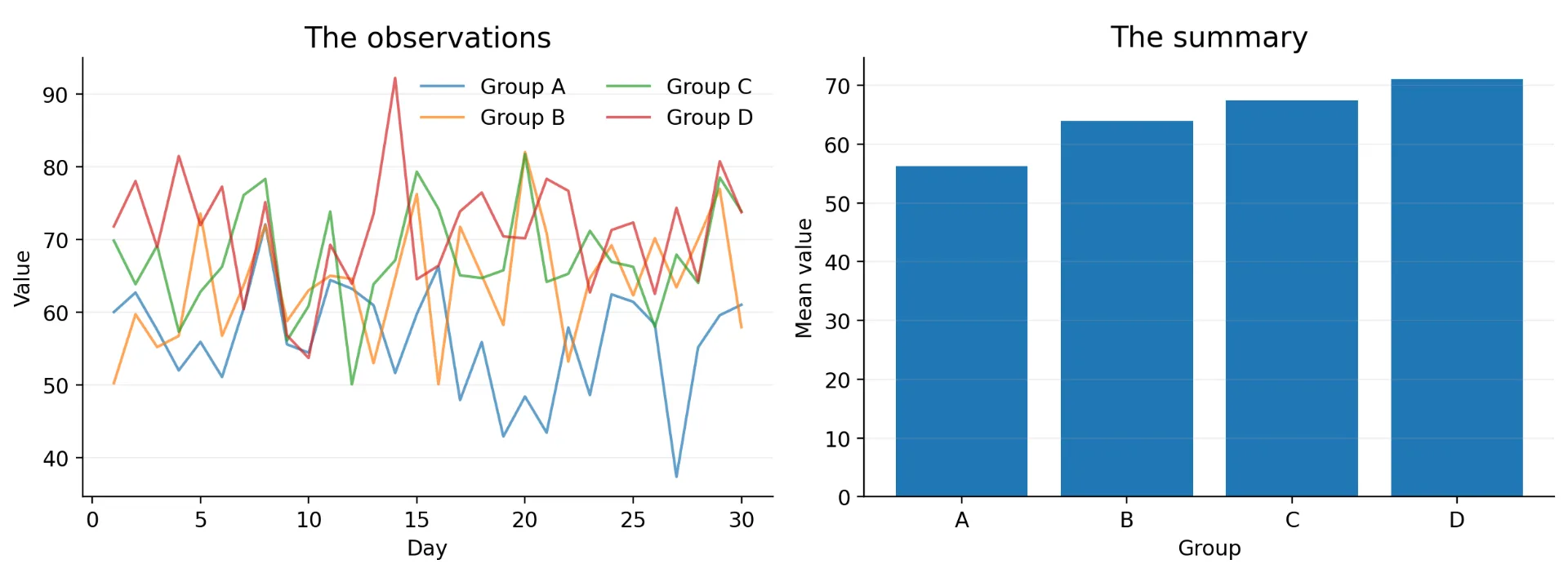
Scale isn’t the only thing that matters. I want you to consider what happens when we aggregate data. Imagine recording the number of users visiting a website every day. If you plot the daily values, you might see volatility, spikes, weekends, and unusual events. Now calculate a weekly average, then a monthly average! The graph becomes smooth. Nothing is wrong with the averages, but some of the information has disappeared.
The spike that happened on Tuesday is no longer visible! The unusually quiet Saturday may have almost no influence on the monthly number. Aggregation can be useful because it helps us see larger trends at the cost of smaller patterns.
3. The normalization
The same problem appears when we move from raw counts to percentages. Assume we have two schools: one has 1,000 students, and another has 100. If 100 students participate in a program at each school, both schools have exactly the same number of participants.
But the story looks very different when we calculate participation rates! The first school has a 10% participation rate, while the second has 100%. This is a good time to remember that when reading data, the visualization doesn’t just communicate an answer; it implicitly communicates which question we are asking.
4. The context
Suppose I want to plot the relationship between age and how long someone has been alive. Yes, I know, it is a ridiculous example, but follow my thought process for a second.
A simple line graph tells us that the longer you have been alive, the older you are.
Not exactly a groundbreaking discovery. Instead, we could use a step graph to emphasize that moving from one age to the next takes a year.
Still not terribly exciting. So, let’s add some flair and change the scale. A logarithmic time axis can emphasize how different a few years feel when we are young compared with later in life.
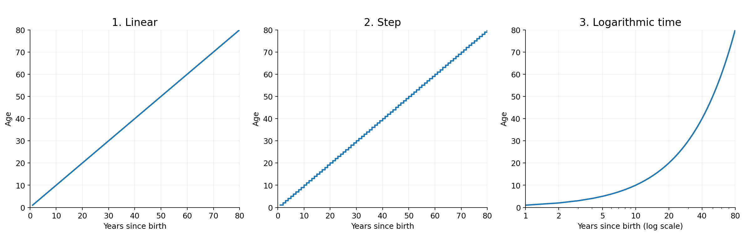
The difference between ages three and six is three years, which is the same as the difference between thirty and thirty-three. Numerically, they are identical…. but, experientially, they can feel very different.
A different representation allows us to explore that feeling. And if we change the scale again, we can emphasize another aspect of the experience of aging. The point I am trying to make here is that no single graph captures the “real” experience of aging.
How to read a visualization critically
Because there is no “right” answer, the next time you see a graph, try asking a few simple questions.
1. What exactly am I looking at? What does each observation represent?
2. What has been transformed? Are these raw values, averages, percentages, normalized values, or something else?
3. What is the scale? Does the axis begin at zero? Is it linear or logarithmic? Are the intervals equally spaced?
4. What has been aggregated? Could important variation have disappeared?
5. What isn’t shown? Are there missing categories, outliers, uncertainty estimates, or relevant contextual events?
6. Why was this particular representation chosen? What does the visualization make especially easy to see?
7. Would I reach the same conclusion from another visualization? This last question is probably my favorite.
If changing the representation dramatically changes your interpretation, that signals you should look more closely at the data itself.
The data didn’t change; the story did
There is something almost uncomfortable about realizing how much influence representation can have. We like to think of data as objective, and in an important sense, the underlying measurements are.
But the moment we decide what to calculate, compare, aggregate, emphasize, and how to display the result, we are making choices, which doesn’t make data visualization subjective nonsense. Instead, it makes visualization an important part of analytical reasoning.
The goal of every visualization is to be honest about which story you are telling, why you are telling it, and what other stories the same data could support.
So the next time you create a graph, don’t just ask:
Is this chart correct?
Ask:
What does this chart make the reader notice?
And when you see someone else’s visualization, ask the same question. Because sometimes the most important thing about a graph isn’t the data it contains; it is the stories we don’t immediately see.