
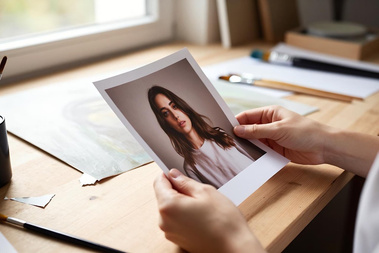
Somewhere on your phone is a photo that’s almost right. A flat-lay of your product on a kitchen worktop where the light is grey and a radiator is creeping into frame. A pencil sketch you’d like to see rendered properly before you commit to paint. A portrait where the pose is perfect and the background is a wheelie bin.
An AI image to image generator exists for exactly that gap — the distance between the file you have and the picture you had in mind. Where a text-to-image tool starts from nothing but words, image-to-image takes your actual file as the launch point and redraws it. You stop describing a scene from scratch and start nudging one that already exists.
What the tool is actually doing to your photo
The mechanics matter because they explain almost every frustrating result you’ll get. The model pushes your uploaded image partway toward visual noise, then rebuilds it guided by your text prompt. A single control — usually labelled strength, denoising, or creativity depending on the platform — decides how far down that path it goes.
- 0.2 to 0.35: a light polish. Backgrounds clean up, colours shift, but the composition is locked. Good for product shots where the silhouette must not move.
- 0.4 to 0.6: the useful middle. Shapes survive, materials and lighting change. This is where most practical work happens.
- 0.7 to 0.9: a loose reinterpretation. You keep the mood and rough layout, and the model invents most of the detail. Expect limbs and edges to wander.
Push strength to 1.0 and you’re basically running text-to-image with your photo as a vague suggestion. That’s not a bug, but it explains why the result looks nothing like what you uploaded.
When starting from an image beats starting from a prompt
You need the composition to stay put
If your subject has to sit in the left third with space for a headline on the right, describing that in words is a lottery. Uploading a rough mock and running low strength keeps the layout honest. This is also why image-to-image is popular for book covers and article headers, where the empty space is part of the brief.
You’re working from your own material
Photographers, illustrators and makers usually want a variation on something they already own rather than a brand new scene. Feeding a sketch or a raw photo in and asking for a specific treatment — risograph print, oil study, overcast daylight — preserves your actual subject while changing how it reads.
You want to iterate instead of restart
Text prompts are great until you get something 80% right. At that point, re-rolling the dice throws away the good parts. Feeding the near-miss back in with a targeted prompt lets you fix the one thing that’s wrong. There’s a full step-by-step walkthrough with real examples if you want to see that loop in action before trying it yourself.
Input quality decides more than your prompt does
A common surprise: people spend twenty minutes rewriting the prompt and thirty seconds choosing the upload. The reverse pays better.
Feed the model a sharp, well-lit, reasonably large file. Crop out clutter before uploading rather than asking the tool to remove it. If your subject fills roughly 40 to 70 percent of the frame, you’ll get far more reliable redraws than if it’s a tiny figure lost in a wide landscape. Straighten the horizon yourself — a two-degree tilt in the source tends to become a five-degree tilt in the output.
Transparent PNGs and heavy compression both confuse things. Export a clean JPEG or PNG at around 1500 pixels on the long edge and you’ve removed half the variables. More of these input fixes are covered in how to actually get good images from a free AI image generator.
Writing a prompt that cooperates with your reference
Your prompt isn’t fighting the image, it’s describing the change. Two habits help.
First, state what stays and what moves. “Keep the table and the three ceramic bowls; replace the background with a plain sand-coloured wall and change the light to warm late afternoon” gives the model a clear division of labour. Vague prompts like “make it better” just re-roll the whole thing.
Second, describe materials and light rather than adjectives. “Brushed aluminium,” “overcast window light,” “matte linen” gives the model something to render. “Beautiful” and “high quality” mostly get ignored, or worse, push everything toward the same glossy stock-photo look.
A repeatable five-step routine
Here’s the loop that works once you’ve done it a few times.
- Prepare the source: crop, straighten, resize, save as a clean file.
- Run a first pass at strength 0.45 with a prompt that names only the changes.
- Judge the result for structure, not beauty — is the right thing in the right place?
- If structure holds, raise strength by 0.1 and refine materials and light.
- If structure breaks, drop strength by 0.1 or simplify the prompt.
Two or three passes usually land it. If you find yourself on pass nine, the source image is probably the problem, not the settings.
Keeping a set of images looking related
One image is easy. Six that sit together on a page is where image-to-image earns its keep, because you can reuse the same reference lighting and colour palette across every asset. Generate your first image until it feels right, then use it as the seed for the rest of the set so the grain, shadow direction and colour temperature stay consistent. The process for doing that at scale is laid out in building a cohesive blog image set with a free AI image generator.
Picking a tool in an afternoon, not a fortnight
Every platform advertises the same features. What separates them is how they handle your specific inputs — product photos versus pencil sketches versus portraits behave very differently across models, and no comparison table will tell you which one flatters your material.
So test with your own work. Take three real files, run identical prompts and strengths through three or four tools, and score the outputs against a fixed checklist: edge integrity, colour accuracy, how often it mangles hands or fine detail, and whether the free tier watermarks or downsizes. That takes about twenty minutes and tells you more than any review. There’s a structured version of this test in how to find the best AI image generator in 20 minutes using your own real work.
Reading the output like an editor, not a fan
The hardest skill with any image-to-image tool is honest appraisal. A picture can feel impressive at thumbnail size and fall apart at full resolution. Zoom to 100 percent and check four things: the edges where your original geometry should have survived, any area with repeating texture, hands and eyes if there are people, and the shadow direction — inconsistent light is the fastest tell that an image was machine-redrawn.
Then apply the blunt test: would you actually use this? Not “is it interesting,” but would it go on the page, in the listing, on the cover. Most first-pass outputs fail that question, and that’s normal. The ones that pass tend to come from a clean source, a modest strength setting and a prompt that described a change rather than a whole new world. Keep those three levers in mind and you’ll spend less time re-rolling and more time shipping. If you want a second filter for deciding what’s genuinely worth keeping, these notes on getting images you’d actually keep from an AI art generator are a useful gut-check.