

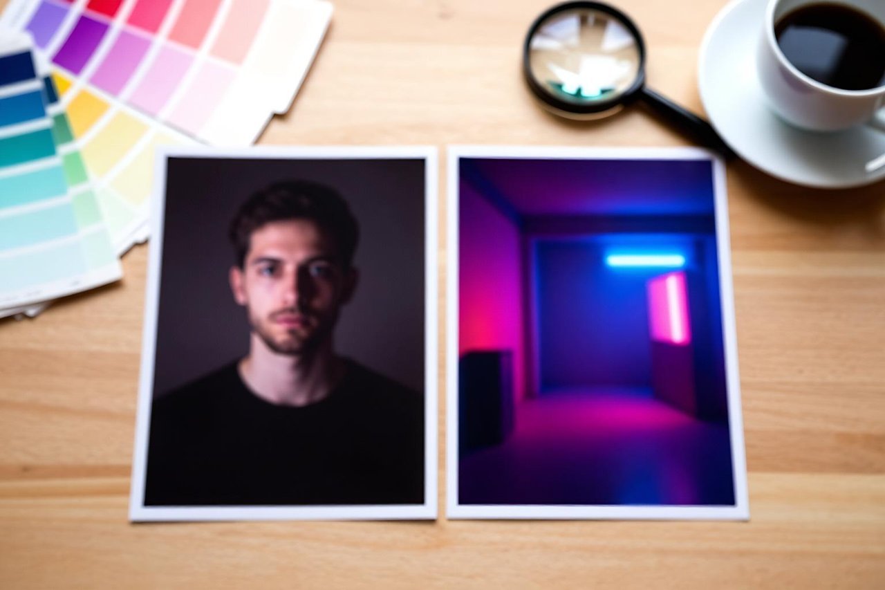
You have a photo. Maybe it’s a phone shot of your dog on a wet street, or a flat, grey headshot you have to hand in for a company page. You don’t want to type a prompt and hope the generator invents something close. You want to feed that exact image into an AI image generator from image and get something recognisably related back out.
Image-to-image does work, but it breaks in predictable ways when you treat it like text-to-image with a picture stapled on. Here is the process I run through when a source photo has to survive the trip, with the numbers and phrasing that make the difference.
Know which mode you’re actually using
Two different features get called the same thing, and mixing them up wastes a lot of time.
- Image-to-image (img2img): the generator re-draws your photo, pixel by pixel, guided by your prompt. The output keeps the original’s composition and contours. Look for a slider labelled strength, denoise, or image weight.
- Reference or image prompt: the model glances at your photo for subject and style cues, then generates something fresh. The link to your original is looser, sometimes barely there.
If you need the person in the photo to still look like the person, you want img2img. If you just want the same colour palette and mood, a reference image is faster and gives the model more freedom. This distinction is the whole reason transforming an existing photo into something new behaves so differently from one tool to the next.
Step 1: Pick a source image that gives the model something to hold onto
The quality of your input caps everything downstream. Before you upload anything, check four things:
Resolution of at least 1024 pixels on the shortest side. Most generators work internally at 1024 or 1536, so a 480px thumbnail gets upscaled first and arrives blurry and detail-free. One clear subject, ideally filling a decent share of the frame. Sharp focus on the face or the product, because motion blur gets re-interpreted as strange smeared texture. And a clean background, since a cluttered bedroom behind your subject becomes a soup of invented objects at higher strengths.
Also crop for the output ratio before you upload. If the tool outputs 16:9 and your photo is 4:3, it will decide for you which part to lose, and it usually picks wrong.
Step 2: Write the prompt as a list of changes, not a description
This is where most people go wrong. They describe the whole scene, which the model then tries to build from scratch and ignores the photo entirely. Describe only what is different.
Weak prompt: a woman in a garden, beautiful, high quality. The generator has no idea what to preserve and produces a generic stranger.
Working prompt: same woman, same pose, now wearing a charcoal blazer, standing in a narrow Tokyo alley at night, neon reflections on wet asphalt, 35mm photograph, shallow depth of field. Now every clause is either a change instruction or a style note, and the phrase same pose tells the model what is off limits.
A concrete swap
A flat, front-lit headshot against a beige wall becomes a studio portrait with one prompt: keep the face and hair exactly the same, replace the background with a dark studio backdrop, add soft directional light from the left, subtle rim light on the shoulders, 85mm lens, editorial portrait. Set strength to 0.4. The face holds, the wall disappears.
If you’re working with a free tier and want the same result without paying for credits, there’s a useful step-by-step guide to getting good results from a free generator that covers the same settings without the subscription.
Step 3: Set strength by what you want to keep
Strength is the single most important number in the whole workflow. It controls how much of your original survives. These bands hold across most tools:
- 0.15 to 0.3: colour grading, relighting, film grain, watercolour wash. The photo stays obviously the photo.
- 0.35 to 0.5: swap the background, change clothing, shift time of day or season. The subject’s face and pose stay intact.
- 0.55 to 0.7: same subject, new scene or new pose. Composition drifts, so use it when you’re willing to lose the framing.
- 0.75 and up: barely a trace of the original remains. At that point a reference image is the better tool.
Start at 0.4. Run three generations at 0.35, 0.45, and 0.6 rather than twelve at the same setting. You’ll learn more about your source photo in two minutes than in twenty re-rolls.
Step 4: Mask the part you actually want changed
If nine tenths of the image is already correct, don’t regenerate the whole thing. Use the inpainting brush or mask tool, paint over only the area that needs work, and feather the edges so the seam blends. A product shot on a bright wooden table: mask the table, prompt for dark slate surface, soft falloff, same lighting direction, and the bottle never gets touched.
Two habits help here. Paint slightly wider than the object you’re replacing, about 5 to 10 percent extra, so the model has room to blend. And keep the prompt for a masked edit short. Long prompts inside a small mask tend to overfill the space with invented detail.
Step 5: Repair the details, then upscale
Hands, eyes, jewellery, thin straps, and any lettering are where image-to-image falls apart. Inpaint them individually at low strength rather than regenerating the whole frame and losing the parts that were working.
Text is its own problem. If you need a sign, a label, or a poster inside the image to read correctly, general-purpose models will hand you plausible-looking nonsense. Tools like Ideogram, which handles text properly, are built for exactly that case, and it’s worth switching tools rather than fighting the one you’re in.
Once the image is right, upscale two times with a dedicated upscaler. Do not push the strength back up and re-roll to fix a small flaw. You’ll lose the version you liked.
Step 6: Save the seed and keep the original untouched
Most generators display a seed number. Copy it somewhere. If you like a result, that number plus the same prompt and strength will reproduce it, and small seed variations let you nudge a near-miss into something usable. And never overwrite the source file. Nine times out of ten the version you rejected on Tuesday is the one you want on Thursday.
Five problems that show up almost every time
- The face changed. Strength is too high. Drop to 0.3 and add keep the face identical to the prompt.
- The output looks nothing like the input. You’re in reference-image mode, not img2img. Check which tab you’re on.
- Everything is soft and mushy. The source was under 1024px. Re-export at full size before uploading.
- Weird objects appeared in the background. Cluttered source photo plus strength above 0.5. Crop tighter instead of prompting around it.
- The same error returns every time. It’s in your source image, not your prompt. Fix the photo or mask the area out.
A full worked example
Source: a 1600×1200 photo of a dim living room, shot at 8:40pm, walls slightly orange from a ceiling bulb. Goal: a bright, airy listing photo.
Crop to 16:9 first, then downscale to 1536 pixels wide. Prompt: same room, same furniture layout, bright daylight through the windows, neutral white walls, soft shadows, wide-angle interior photography, no people. Strength 0.45. First pass came back with a believable room but a blown-out window, so mask just the window area and run a second pass at 0.3 with late afternoon sky, soft gradient, subtle glare on the glass. Upscale 2x. Total time: about eleven minutes including the failed first attempt.
That same eleven-minute loop is the reason image-to-image is worth learning properly. If you’re still deciding what to run it in, a comparison of which image generators actually deliver in 2025 will save you a week of trial and error.
Where this workflow earns its keep
Product variants are the clearest win. Photograph one item once, then mask and re-render the surface, background, and lighting to produce a dozen colourways without a second shoot or a lighting rig. Real estate is the second: afternoon photos turned into twilight exteriors, which is the single most requested edit in that industry and one of the easiest to pull off at strength 0.4.
Then there’s restoration and upscaling of old family photos, where the goal is to add nothing and repair everything, so keep strength under 0.25 and mask damage rather than re-rendering the whole face. And there’s the simple personal use case: a photo of your street as a cyberpunk poster, your dog as a Renaissance oil painting, your wedding photo in winter.
The pattern across all of them is the same. Small changes, low strength, masks for precision, and short prompts that say what to keep before they say what to change. Run three variations instead of twenty, compare them side by side, and keep the seed of anything that works. Ten focused minutes beats an hour of re-rolling, every time.