
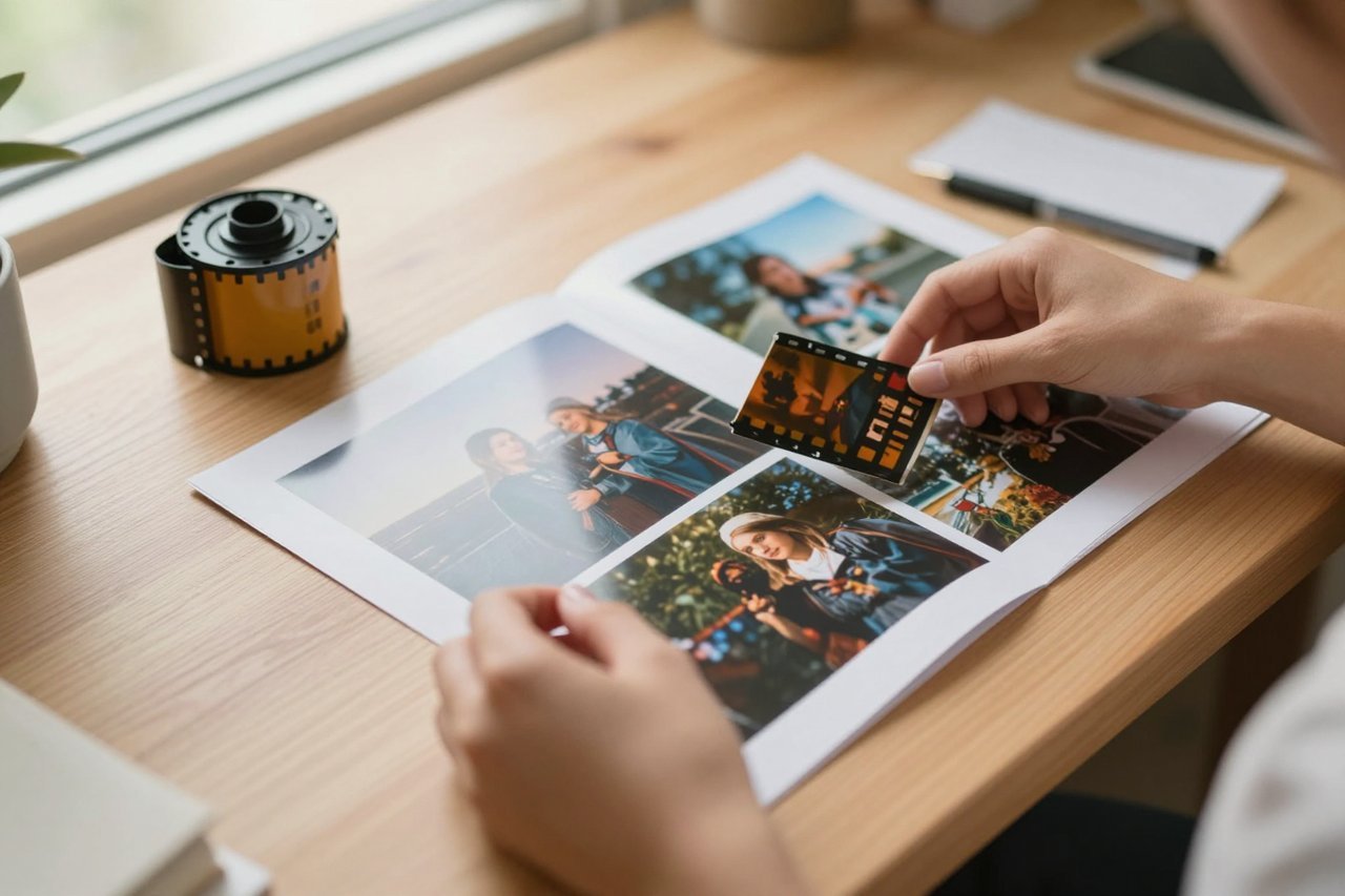
Say you shot a portrait on your phone against a cluttered kitchen wall. The pose is right. The light on the face is decent. The background is a disaster, and the jacket is the wrong colour for the brand you’re shooting for. A text prompt can’t give you that exact pose back. Image to image AI can. You hand the model your photo, describe what the scene should become, and it rebuilds the picture while holding on to the parts you wanted to keep.
That’s the whole trick, and also the whole problem. How much the model holds on is a single setting, and getting that setting wrong explains most disappointing results.
What’s actually happening under the hood
Diffusion models learn by adding noise to images and then learning to reverse the process. In text to image, the model starts from pure static and carves a picture out of it, guided by your words. In image to image, it doesn’t start from static. It starts from your file, adds a measured dose of noise on top, then denoises with your prompt steering each step.
The early steps decide composition and shape. The later steps decide texture, colour and light. Cut the process short and you keep more of the original. Let it run and the model drifts further from what you uploaded. That’s why the prompt in an image to image job has less to do than in text to image, but more to live up to. If you’re used to writing long prompts for generation from scratch, text to image AI behaves quite differently, because there the prompt carries the entire structure of the picture.
The strength setting does more than any prompt
Different tools call it different things: strength, denoise, image weight, creativity. It’s usually a number between 0 and 1, and it’s the only slider worth mastering first.
- 0.15 to 0.3 — a light pass. Removes noise, smooths compression artefacts, nudges colour. Composition survives almost untouched. Good for cleaning up a photo you already like.
- 0.35 to 0.55 — the useful middle. Materials, lighting and background can change while the subject’s position and silhouette stay recognisable. This range handles most product shots and style changes.
- 0.6 to 0.8 — a genuine reinterpretation. Loosely related to your source. Fine for turning a pencil sketch into a rendered illustration, risky for anything where identity matters.
- 0.85 and above — you’re basically generating from scratch with a faint ghost of your image as a suggestion. At this point the source barely matters.
Run the same prompt at 0.35 and 0.7 and you’ll get two completely different images. If a result looks nothing like your photo, the strength was too high. If the change you asked for never appeared, it was too low.
Jobs where image to image earns its keep
Product and e-commerce shots
A seller photographs a ceramic mug on a kitchen table, then reruns it against seamless grey at a strength of about 0.4. The mug’s proportions and handle stay exact because the model is working from a real photograph of that mug. This is where creators save real money on studio time.
Sketch to finished render
Interior designers and illustrators feed in a rough line drawing or a grey-box 3D blockout and ask for a photoreal treatment. Line art survives even medium strength settings because strong edges are the last thing the noise destroys.
Restyling an existing image
Take a finished photo and push it toward watercolour, film grain, or a particular lighting mood. Because you’re changing surface rather than subject, 0.45 to 0.6 usually lands well. If you want to understand a model’s visual habits before you commit a real photo to it, spending twenty minutes with AI art generators on throwaway prompts tells you a lot about its strengths.
Consistency across a set
Reference-image features (Midjourney’s style and character references, Stable Diffusion’s IP-Adapter and similar tools) let one photo anchor an entire series, so a character keeps the same face across eight images. It’s imperfect, and faces drift, but it’s far better than re-describing someone in words each time.
Controls worth learning beyond the slider
Describe the destination, not the edit. The most common beginner mistake is prompting “make the jacket red.” The model doesn’t know what to keep. Write the whole scene instead: “woman in a red wool jacket standing on a grey concrete step, overcast daylight, 50mm look.”
Use masks for small changes. Inpainting lets you paint a region and regenerate only that area, leaving everything else pixel-identical. Changing a logo, a hand, or a single object? Mask it. Don’t rerun the whole frame.
Add structure controls. ControlNet variants that read depth, edges or body pose let you dictate layout far more precisely than a prompt can, and they hold up at higher strengths.
Lock the seed. If you find a result you almost love, fixing the seed and adjusting one variable at a time turns guesswork into a repeatable process.
When the output looks worse than what you started with
Muddy, grey, low-contrast results almost always trace back to the source file. A 600-pixel screenshot full of JPEG noise gives the model very little to work with. Running the source through an AI image enhancer before the edit can lift a poor source enough to change the outcome entirely.
Other frequent failures:
- Prompt ignored entirely. Strength too low, or the prompt contradicts the source too hard. Split the difference: raise strength by 0.1, or change the source.
- Faces going generic. The model averages facial features. Keep strength under 0.4 for portraits, or mask the face out of the regeneration.
- Texture soup. Fine repeating detail (lace, mesh, small print, fingers) turns to mush. Fix it in a second masked pass at low strength rather than rerolling the whole image.
- Soft, small output. Finish with an upscale rather than pushing strength higher, since AI upscalers rebuild detail that generation tends to smooth away.
A workflow worth copying
Start with the best version of your source you can get: correct crop, correct aspect ratio, no heavy compression. Write a prompt that describes the finished scene in plain, concrete terms and include a negative prompt for whatever keeps creeping in. Set strength at 0.4, generate four variants, and compare. Then move the slider in 0.1 steps toward whichever direction you needed. Once the composition is right, switch to masked passes for the details that failed. Upscale as the final step, never the first.
Keep a note of the model, the seed, the strength and the prompt for anything you might need to reproduce. Clients come back three weeks later asking for the same look on a new photo, and guessing costs hours.
Free tiers, credits and hidden resolution caps
Most hosted tools meter image to image the same way they meter generation, and a few charge extra for the upload. Free plans often cap output resolution and quietly downsample your source, which is why results can look softer than the file you provided. Free AI image generators come with real limits on resolution and commercial use, and it’s worth reading those before you build a client deliverable on one. Running a local model costs nothing per image if you have the hardware, and gives you full control over strength, masking and seed.
Whose face is it, and who owns the result
Two practical rules keep you out of trouble. Don’t upload photographs you don’t have rights to, and treat other people’s faces as sensitive by default. Likeness rules in most jurisdictions don’t care that the output is “AI-generated” if the person is recognisable and hasn’t agreed to the use. If a client supplies a model’s photo, get written confirmation that the usage covers synthetic edits.
Check the terms on whether uploads are used for training, since several consumer tools default to yes and bury the toggle in settings. On ownership, most paid platforms grant you commercial rights to outputs while disclaiming any guarantee about copyrightability, which is still unsettled in the US and elsewhere. Save the original file, the prompt, the settings and the platform’s terms page alongside the final image. If a question ever arises about how a picture was made, that folder answers it in thirty seconds.