

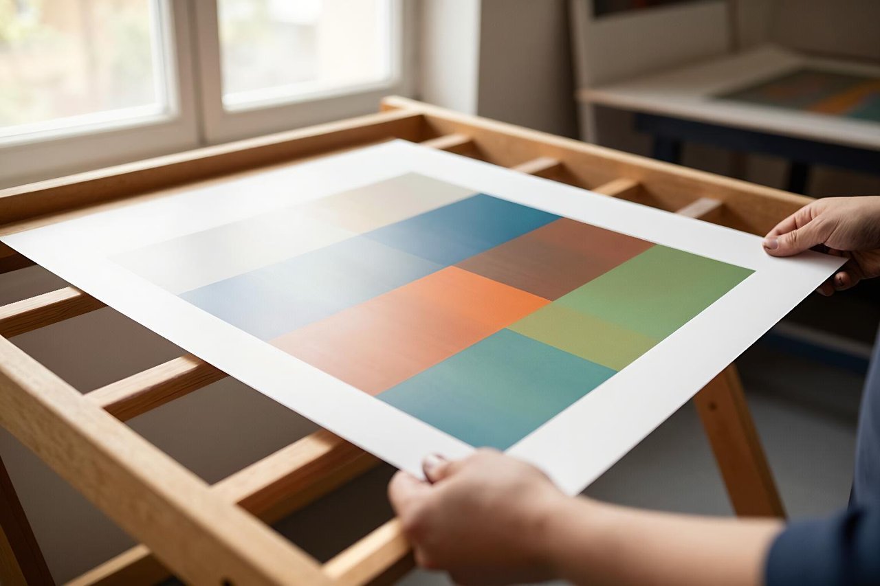
A gig poster. A school fete notice. A fundraiser for a mate who came off his bike. Most of the posters in the world are made by someone who isn’t a designer, on a laptop, at 11pm, the night before they’re needed. That’s the gap an AI poster generator actually fills. Not glossy brand campaigns, not the work you see framed in design studios. The unglamorous, deadline-driven, “I need this at A3 by Friday” jobs.
These tools have shifted from blurry novelty to genuinely useful in about eighteen months. They are still not magic. Feed two different people the same lazy prompt and you get two versions of the same poster, which is why so much AI artwork currently looks like it came off the same production line. Here’s how to work with the technology instead of against it.
What an AI poster generator is actually good at
Visual direction, mostly. Ask for a 1970s screen-printed jazz night and you’ll get convincing halftone texture, muted ochre and burnt orange, slightly off-register colour blocks. Ask for a Scandinavian folk festival and you’ll get flat illustration, soft greens, hand-cut shapes. That kind of moodboarding used to cost you an afternoon on Pinterest. Now it takes forty seconds.
Iteration speed is the other big win. Twenty variants in three minutes, side by side, is a fundamentally different way of working to sketching three layouts by hand and hoping one lands. If you’re briefing a committee or a client who “will know it when they see it”, that volume is worth more than any single polished output.
The text problem, and the workaround that fixes it
Almost every generator still turns “LIVE AT THE DUKE, FRIDAY 9PM, £8” into alphabet soup. The models approximate letterforms rather than spell words, so you get something that reads like Welsh as dreamed by a photocopier. This is the single biggest reason people give up on AI poster design.
There are two fixes. The first is to use a model that handles type properly, and Ideogram is currently the one that reliably gets text right. Even there, keep headline copy under about six words and check every letter at full zoom before you commit.
The second fix is better, and it’s what most working designers do: generate artwork only, deliberately leaving a clear band or open area where the type will go, then set the words yourself in Canva, Figma or Photoshop. A poster with gorgeous AI artwork and cleanly typeset text looks intentional. A poster with AI-generated text looks like exactly what it is.
How to write a prompt that produces a usable poster
Vague prompts give you vague posters. The structure that works is roughly: format, subject, medium or art style, palette, composition note, text space. For example:
“Vertical gig poster, A3 ratio. Abstract screen-print of a saxophone silhouette dissolving into geometric blocks. 1960s Blue Note style, three-colour palette of cream, deep teal, ochre. Bold central composition, empty cream band across the top third for typography, no lettering.”
That last clause matters more than any other. Telling the model to omit text is not a guarantee, but it improves your odds considerably.
- Name the medium, not the mood. “Risograph print” or “cut-paper collage” gives the model far more to grip than “modern and clean”.
- Limit the palette. Two or three colours reads as designed. Seven reads as a stock photo with a filter.
- State the empty space explicitly and where you want it: top, bottom, left third.
- Skip the legacy incantations. “4K, trending on ArtStation, masterpiece” does essentially nothing on 2025-era models and just wastes prompt space.
- Keep a prompt log. When something works, save it. You’ll reuse the structure for a whole season of posters.
If you’re new to this, there’s a fuller method in this walkthrough on getting consistently good images out of a free AI image generator, which applies almost line for line to poster work.
Aspect ratio, bleed and resolution: the unglamorous details
Posters are not square, and getting this wrong wastes an hour. A3 is roughly 1:1.41, A2 the same, and a US Letter flyer is 8.5:11. Instagram wants 4:5 or 9:16. Choose the target ratio before you generate, because cropping a carefully composed poster art to a new shape destroys the layout.
Resolution catches people out too. Most generators hand back something around 1024 pixels on the long edge, which is fine on screen and soft on paper. A poster viewed from two metres needs roughly 150 DPI at final size; anything held in the hand wants 300. That means running the output through an upscaler before print, and adding 3mm of bleed with all text at least 5mm inside the trim. Printers will not warn you. They’ll just send back a poster with a white sliver down one edge.
Feeding in a reference image when the style must match
If a venue already has a visual identity, or last year’s poster exists and this year’s needs to sit beside it, describing the style in words is slow and imprecise. Image-to-image is the shortcut: upload the previous poster or a reference photo, set the style strength somewhere around 0.4 to 0.6, and change the subject. Low enough to keep the palette and texture, high enough that it isn’t a copy. There’s a step-by-step on using an AI image generator from an image that covers the slider settings in more detail.
Free tiers versus paid plans
If you make one poster a year, free is genuinely enough. Expect watermarks on some tools, a daily cap of twenty to fifty generations, and licensing terms that often exclude commercial use, which matters the moment your event charges for tickets. If you’re producing posters weekly for a venue, a paid tier at roughly £8 to £20 a month buys back an hour of your time in the first week.
The paid tiers also tend to include upscaling and commercial rights, which are the two things free plans quietly leave out. There’s a broader comparison of where the money is worth spending in this roundup of the best AI tools in 2025 and what’s actually worth paying for.
Six habits that make a poster look AI-generated
- Leaving the headline text to the model and hoping.
- Stacking four fonts, three illustrations and two gradients on one sheet.
- Centring absolutely everything, which flattens the hierarchy.
- Ignoring bleed and safe margins until the printer complains.
- Generating at 1:1 and cropping to A3, which clips the composition.
- Never looking at it from three metres away, where it will actually be read.
The three-second test before you send it to print
Stick the poster on a wall, walk back three metres, and squint until the detail disappears. Can you still make out the headline, the date and the venue? If any of those three blurs into mush, the poster has too much on it, and the fix is subtraction rather than another generation.
Almost every weak poster fails from excess: three supporting acts, a QR code, four sponsor logos, a paragraph of copy nobody reads while walking past. Cut until only the essentials survive, then print one A5 proof on the actual paper stock before committing to a run of fifty. Screens lie about contrast, and a design that glows on a laptop can go muddy and flat under indoor lighting. One cheap proof, one honest squint, and you’ll catch the problems that no amount of prompting will fix for you.