

Most people meet Midjourney AI the same way: they type “a dragon in a forest” into Discord, get four soft-focus pictures that look nothing like the dragon in their head, and quietly close the tab. The tool isn’t the problem. The prompt is a wish, not a brief.
What follows is the workflow I use now, in order, with the actual wording and parameter changes at each stage. No art school required, and you can follow every step on a basic plan.
Decide the Format Before You Write a Single Word
Aspect ratio isn’t a finishing touch, it’s a structural decision. It changes where the subject sits, how much background the model invents, and whether your crop survives contact with a real layout.
Some quick defaults that hold up:
- YouTube thumbnail or blog header: –ar 16:9
- Instagram feed: –ar 4:5
- Print poster or book cover: –ar 2:3
- Phone wallpaper: –ar 9:16
Get this wrong and you’ll end up zooming out and cropping, which softens detail and loses the composition you paid for. If you’re still weighing which plan gives you enough fast hours for the volume you need, the breakdown of Midjourney plans and prompt behaviour is worth ten minutes before you spend anything.
The Five Ingredients of a Prompt That Lands
Longer prompts aren’t better prompts. Specific ones are. I aim for five ingredients and stop:
- Subject — the actual noun, described physically: “handmade stoneware mug” beats “mug.”
- Detail or action — what’s happening: “steam curling from the rim.”
- Environment — where it sits: “on a raw oak table beside a linen napkin.”
- Light — direction and quality: “morning sun through a window at a low angle.”
- Camera or medium — “85mm lens, shallow depth of field” or “gouache on cold-press paper.”
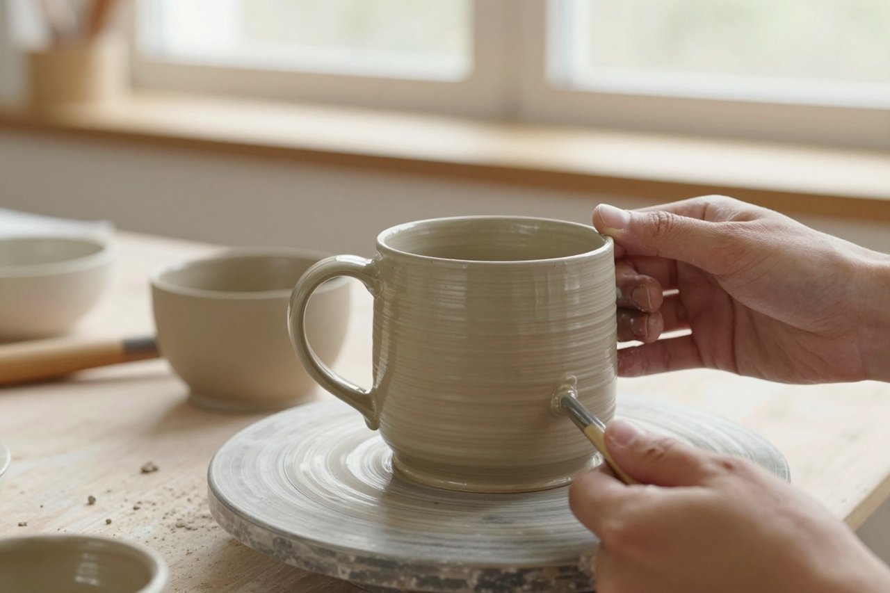
Paste those together and you get: handmade stoneware mug with matte speckled glaze, steam curling from the rim, on a raw oak table beside a crumpled linen napkin, morning sun through a window at a low angle, 85mm lens, shallow depth of field –ar 4:5 –stylize 180.
The light clause is the one people skip, and it’s the one doing the most work. Swap “morning sun” for “overcast north-facing window” in that prompt and you get a completely different mood without touching anything else.
One Real Run, Start to Finish
Here’s how that mug prompt actually played out.
Attempt one: “ceramic coffee mug on a table.” Result: four perfectly fine, completely forgettable images. Flat lighting, plastic-looking glaze, background clutter.
Attempt two: added the glaze, the steam, and the oak table. Better subject, but the light was still coming from everywhere, so nothing had shape.
Attempt three: added “morning sun through a window at a low angle” and cut the word “coffee,” which was pulling in generic diner props. Two of the four became usable.
Attempt four: I kept the best seed, added –no handle, text to kill a warped handle and a phantom shop logo, and nudged –stylize from 100 to 180 for a slightly more editorial feel. That’s the one that shipped.
Four runs, maybe six minutes. That ratio is normal. Anyone showing you a one-shot miracle is showing you run forty.
The Parameters Worth Memorising
You don’t need all of them. You need these five.
–stylize (0–1000)
Controls how much artistic licence the model takes. Low values (0–50) stay literal and photographic. Around 250–400 you get stronger colour grading and composition. Past 700 things get painterly and start ignoring your specifics.
–chaos (0–100)
How much the four grid images differ from each other. Default is 0, which means four near-twins. Push to 15–25 when you’re exploring a concept and want genuine options rather than variations.
–no
Your negative prompt. –no text, watermark, logo saves an enormous amount of retouching. It’s a nudge, not a guarantee.
–seed
Lock a seed and you can change one word and keep everything else recognisable. This is how you iterate instead of gambling.
–weird and –tile
–weird produces strange, off-kilter aesthetics that are occasionally exactly right. –tile makes seamlessly repeating patterns, which is genuinely useful for fabric, wallpaper, and texture work.
Fixing the Three Failures You’ll Hit Most
Melted hands and extra fingers
Don’t fight it by asking for “perfect hands.” Either reframe the shot so hands are partly out of frame, or pose them holding something, which gives the model a shape to anchor to. If a good image has one bad hand, use Vary Region and redraw just that area with a short, plain description.
Text that reads like runes
Stop asking for words inside the image. Generate the scene clean, then set type in Canva, Figma, or Affinity. It’s faster than regenerating fifteen times, and the kerning will be correct. There’s a fuller walkthrough of this in these six steps to usable Midjourney results, which is where I first learned to stop fighting the model on text.
Everything looks the same
That’s low chaos plus a high stylize value flattening your options. Drop stylize to 50, raise chaos to 20, and run again. You’ll get a wider spread to choose from.
Borrowing From Images You Already Own
Two tools do most of the heavy lifting here. –sref copies the visual style of a reference image: its palette, grain, and rendering. –cref keeps a character consistent across shots, which matters if you’re building a series with the same face.
Add –iw to an image prompt to control how strongly that image influences the result. A low value treats it as a loose suggestion; high values keep the composition close.
One caution: using someone else’s photograph or artwork as a style reference is a legal and ethical grey area that gets greyer the more recognisable it is. There’s a useful framing of where the lines actually sit in what it takes to build AI systems you can defend, and it’s worth five minutes if you’re doing commercial work.
Building a Look You Can Repeat
The difference between people who get good Midjourney output and people who get lucky once is a saved prompt library. When a run works, save four things:
- The full prompt text, parameters included
- The seed number
- The aspect ratio and stylize value
- A note on what you changed from the previous attempt
Do this for a month and you stop starting from zero. You develop a house style, which is what actually separates a portfolio from a folder of images. That instinct is also why Midjourney tends to appeal to illustrators and designers more than pure novelty seekers, a point the case for Midjourney as the artist’s tool of choice makes well.
There’s a related trap worth naming: letting the model make every aesthetic decision for you. If you can’t tell which parts of an image are yours, the work stops feeling like yours. Keeping your own hand in AI-assisted painting is the longer version of that argument, and it’s the one I’d hand to anyone planning to sell what they make.
What Separates a Good Session From a Wasted Hour
Three habits do most of the work.
Write the brief before you open Discord. One sentence describing the image, the format, and the mood. If you can’t write that sentence, more prompts won’t fix it.
Change one variable at a time. New subject, new light, new lens, new stylize value. Change three at once and you learn nothing about which one mattered.
Stop at good enough, not perfect. A 90% image plus fifteen minutes of cleanup in Photoshop beats a hundred generations hunting for a flawless one that never arrives. The models are a starting point with a very high ceiling, and the ceiling only opens when you know what you’re asking for and why.